Quiz Entry - updated: 2026.07.30
What is a Risikomatrix (risk matrix) and how does it visualise risk?
A 5×5 grid with Likelihood on the Y-axis and Impact on the X-axis — each cell coloured green→red to show severity at a glance.
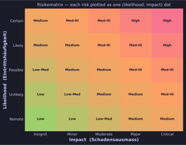
* A 5×5 risk matrix: likelihood × impact, coloured green→red; each risk is plotted as one dot. *
The standard layout:
- Y-axis (Likelihood): Remote → Unlikely → Possible → Likely → Certain
- X-axis (Impact): Insignificant → Minor → Moderate → Major → Critical
- Cells are coloured (green / yellow-green / yellow / orange / red) and labelled (Low / Low-Med / Medium / Med-Hi / High)
How risks land on it:
- Each identified risk gets one dot/marker based on its (likelihood, impact) pair.
- Multiple risks plotted on the same matrix become a Risk-Map (or Risiko-Landkarte).
Why it's everywhere:
- Übersichtlich — non-experts grasp it in 5 seconds.
- Communication-friendly — boards love it.
- Prioritisation aid — top-right (red) gets resources first.
Why it's dangerous:
- "Tendency to everything-yellow" — assessors anchor to the middle to avoid controversy.
- Replaces critical thinking with best-practice colouring.
- Strongly biased by assessor experience; not reproducible.
- No real quantitative output — you can't compute ROI of a control directly from a colour.
Tip: Doug Hubbard's "How to Measure Anything in Cybersecurity Risk" is a famous critique — read it before you defend any risk matrix in front of a quant-leaning audience.
Go deeper:
 Risk matrix (Wikipedia) — the likelihood × consequence grid plus the Cox/Hubbard critiques of its resolution.