A bar chart showed that among infected over-60s, most were vaccinated, and this was used to argue the vaccine doesn't work. Why is that conclusion a statistical error?
Because it ignores the base rate: when almost everyone is vaccinated, most infected people will be vaccinated too — even if the vaccine works very well.
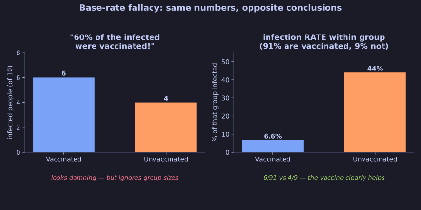
* The same infection numbers read as damning or reassuring, depending on the base rate. *
This is the base-rate fallacy, and it's a classic way numbers mislead. Suppose that among the over-60s, 91% are vaccinated and 9% are not. If 10 of every 100 get infected, the raw counts might be 6 vaccinated and 4 unvaccinated infections — so "60% of the infected were vaccinated!" sounds damning.
But you must compare against the group sizes:
- 6 infections out of 91 vaccinated ≈ 6.6% infection rate.
- 4 infections out of 9 unvaccinated ≈ 44% infection rate.
So the unvaccinated are far more likely to be infected — the vaccine clearly helps. The headline number ("most infected were vaccinated") is true but meaningless without the base rate.
Tip: Whenever you hear "most of group X who had outcome Y were [common trait]," ask: how common is that trait in the whole population? In a near-fully-vaccinated group, "most cases are vaccinated" is expected, not alarming.
Go deeper:
 Base rate fallacy — the probability trap in general form, with the classic medical-test example.