Two quantities (e.g. number of pensions and total pension spending) both grow over decades. How can indexing them to a chosen base year make them tell opposite stories?
Rebasing everything to "100%" at a year you pick lets you make two series look parallel, or wildly divergent, purely by moving the baseline.
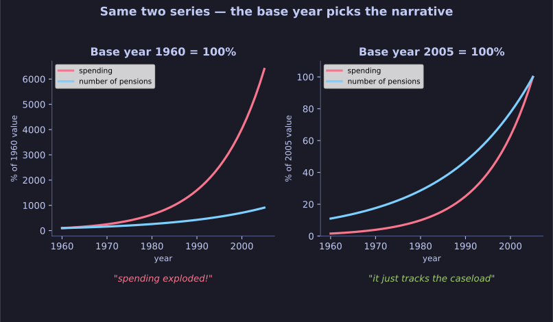
* The same two series, indexed at 1960 vs 2005 — the base year picks the narrative. *
If you plot the raw numbers, count-of-pensions and total-spending each rise, but on different scales — hard to compare. So people index them: set both to 100% in a chosen base year and plot the percentage change since then. The trap is that the choice of base year reshapes the whole picture:
- Base it at 1960 and a tiny early value becomes the denominator, so later figures balloon to thousands of percent — dramatic divergence.
- Base it at 2005 (near the end) and everything is squeezed toward 100% — the same data now looks flat and parallel.
Both charts are "true," yet they support opposite narratives ("spending exploded!" vs. "it tracks the caseload"). A logarithmic axis is often the honest fix, because it shows proportional growth and stops a small starting value from dominating.
Tip: Whenever a chart says "(Year) = 100%," ask why that year. The base year is a choice, and the choice is the spin.
Go deeper:
 Misleading graph — how rescaling and the choice of baseline reshape a chart's story.